/degrees-of-comparison-charts · classroom
Degrees of comparison charts: positive, comparative and superlative
Make your ownDegrees of comparison charts
Describe yours. We'll remake the whole pack your way.
More like this
the whole catalog →
every sample — three subjects, three styles ↓
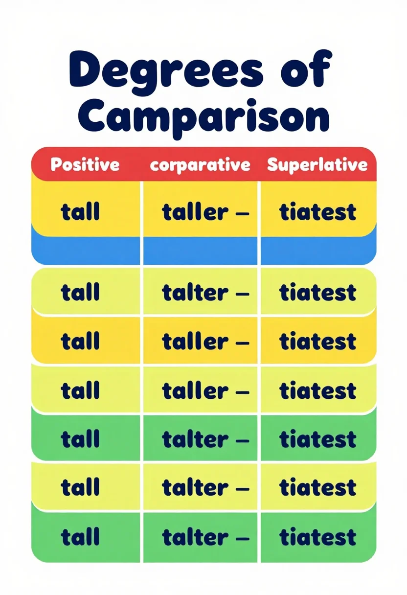
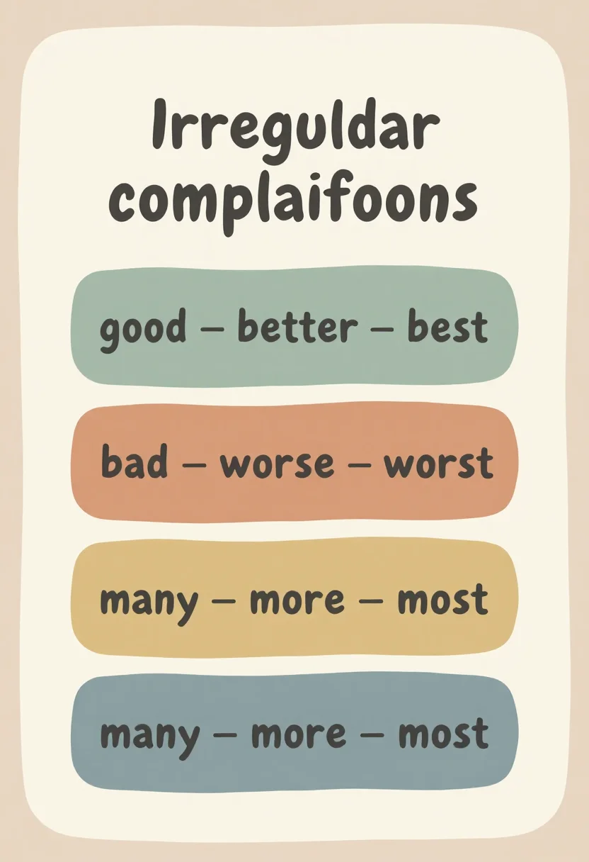
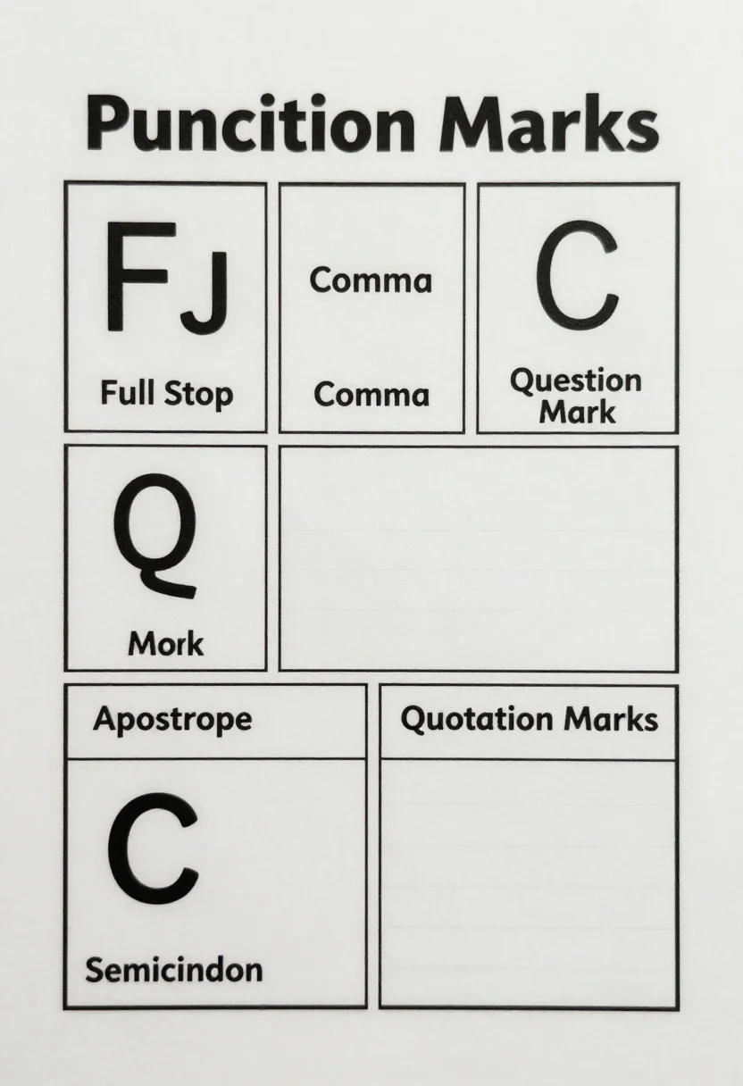
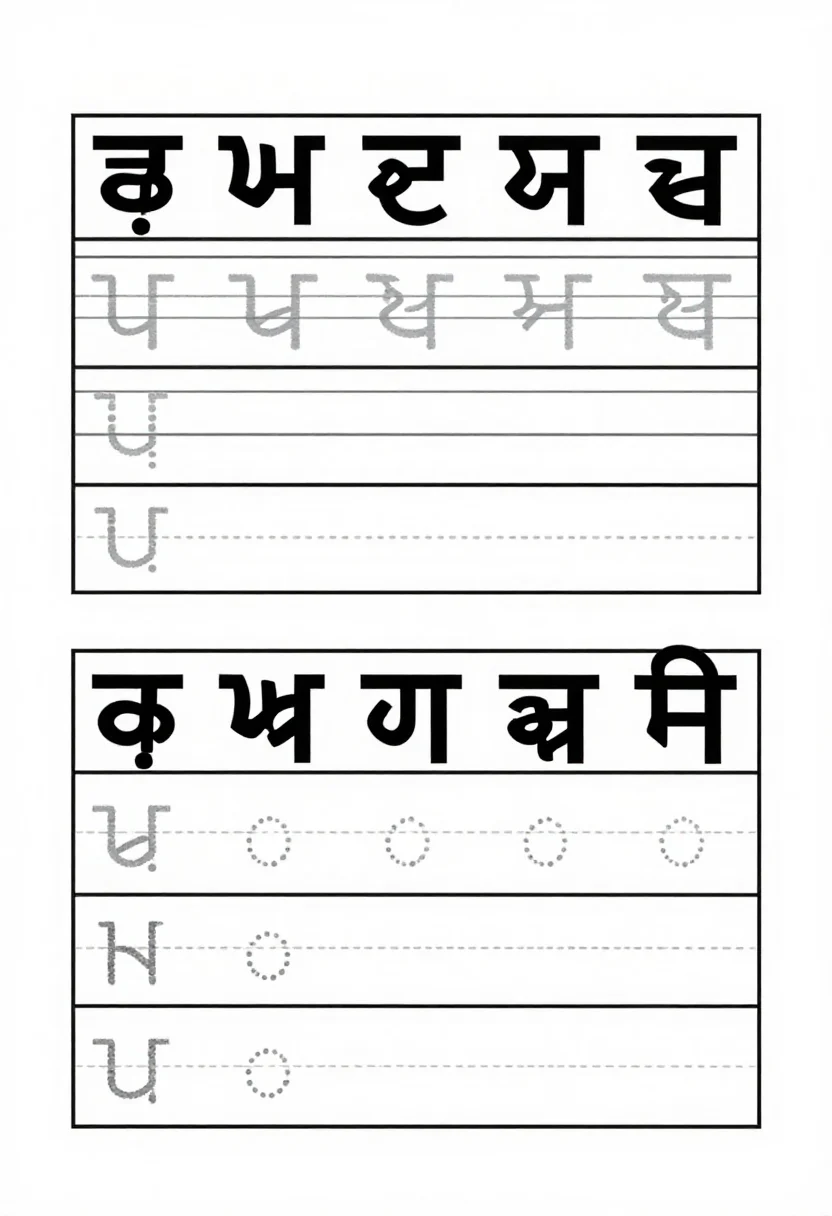
A degrees of comparison chart to show how big becomes bigger and biggest. The three charts set out positive, comparative and superlative in three columns, such as tall, taller and tallest; show three bears of growing size; and list irregular forms such as good, better and best. Each comes as a bright flat poster, a crayon hand-drawn version or a boho pastel print. Type a direction such as short words, and the same three styles follow it.
- a grammar wall for a comparing lesson
- a degrees page in a workbook
- a primary classroom reference
- a revision sheet before a test
Frequently asked questions
- What do the nine pictures show?
- Three charts in three styles: a table of three columns with rows such as tall, taller and tallest; three bears of growing size; and three irregular rows, good, bad and many.
- How do the three styles differ?
- Bright flat is a clean poster in red, yellow, blue and green. Crayon hand-drawn has wobbly outlines and paper grain. Boho pastel is a calmer print in sage, terracotta and mustard.
- Can I change the adjectives?
- Yes. Type the direction you want, such as short words, and the chart follows it. That is a request, not a fixed result, so check the words before you print.
- Can I print it?
- Yes. Each picture is a tall portrait page with a margin, which suits a wall or a notebook page.
About toile
This page is a showcase and a starting point: nine samples already rendered, three readings of the pack crossed with three styles, each shown at the size and ratio it was made for. Take any of them further on the wall with a few words, or ask for all nine again under your own direction; a sign-in keeps what you make, and it is free while Toile is new. The recipe behind each sample — the subject, the style, the palette, the framing — travels with the image rather than staying private to the render: it is in the alt text of every sample and in the page's own structured data, so a search engine reads the same handles a person would.