/gothic-letters · illustration
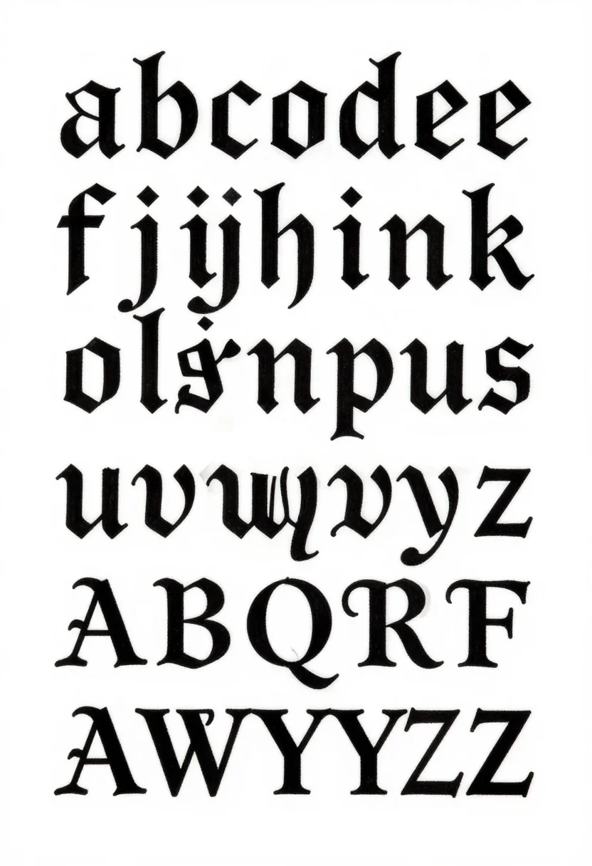
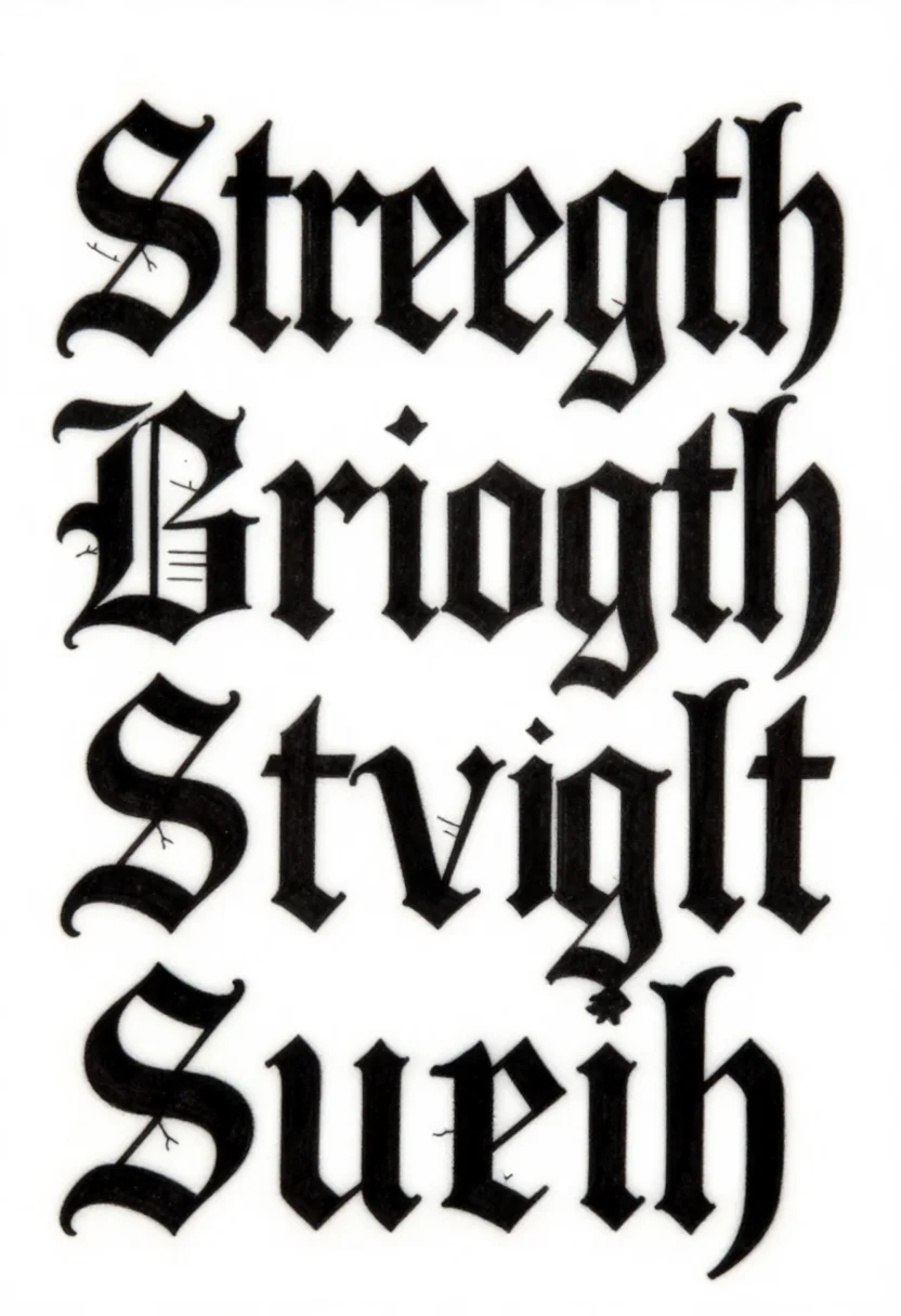
Gothic letters: textura and fraktur alphabets, a blackletter word
Make your ownGothic letters
Describe yours. We'll remake the whole pack your way.
More like this
the whole catalog →

every sample — three subjects, three styles ↓
Gothic letters are blackletter alphabets for tattoos, titles and calligraphy study. The nine sheets show the textura lowercase in four rows, the fraktur capitals with broken curves and small hairlines, and the word Strength in large blackletter. Each set comes as solid black broad strokes, as a thin outline with white inside, or with decorated capitals and pointed finials. Ask for a name, a dragon or a cross as the subject.
- a calligraphy study sheet
- a title for a poster or a book
- a tattoo design reference
- a framed word or name
Frequently asked questions
- What is the difference between textura and fraktur?
- Textura has dense, upright strokes with diamond feet. Fraktur has broken curves and small elephant-trunk hairlines.
- Are the alphabets complete?
- The textura sheet shows lowercase a to z. The fraktur sheet shows the capitals A to Z.
- What are the three styles?
- Solid black has broad pen strokes with fine hairlines. Outline is a thin line with the strokes left white. Ornate adds decorated capitals, pointed finials and small flourishes.
- Can I get a name in blackletter?
- Yes. Ask for a name, a dragon or a cross, and the blackletter is set to that subject.
About toile
This page is a showcase and a starting point: nine samples already rendered, three readings of the pack crossed with three styles, each shown at the size and ratio it was made for. Take any of them further on the wall with a few words, or ask for all nine again under your own direction; a sign-in keeps what you make, and it is free while Toile is new. The recipe behind each sample — the subject, the style, the palette, the framing — travels with the image rather than staying private to the render: it is in the alt text of every sample and in the page's own structured data, so a search engine reads the same handles a person would.