/tortoiseshell · pattern
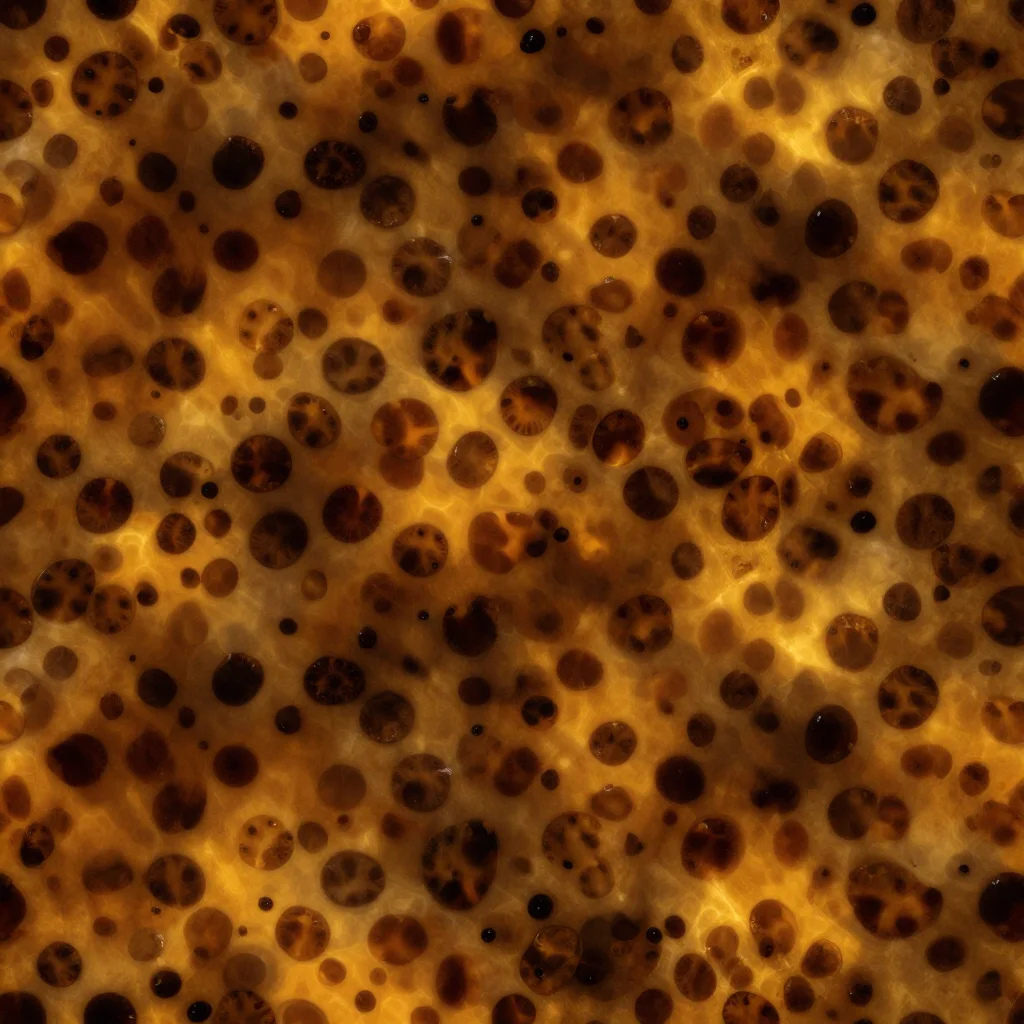
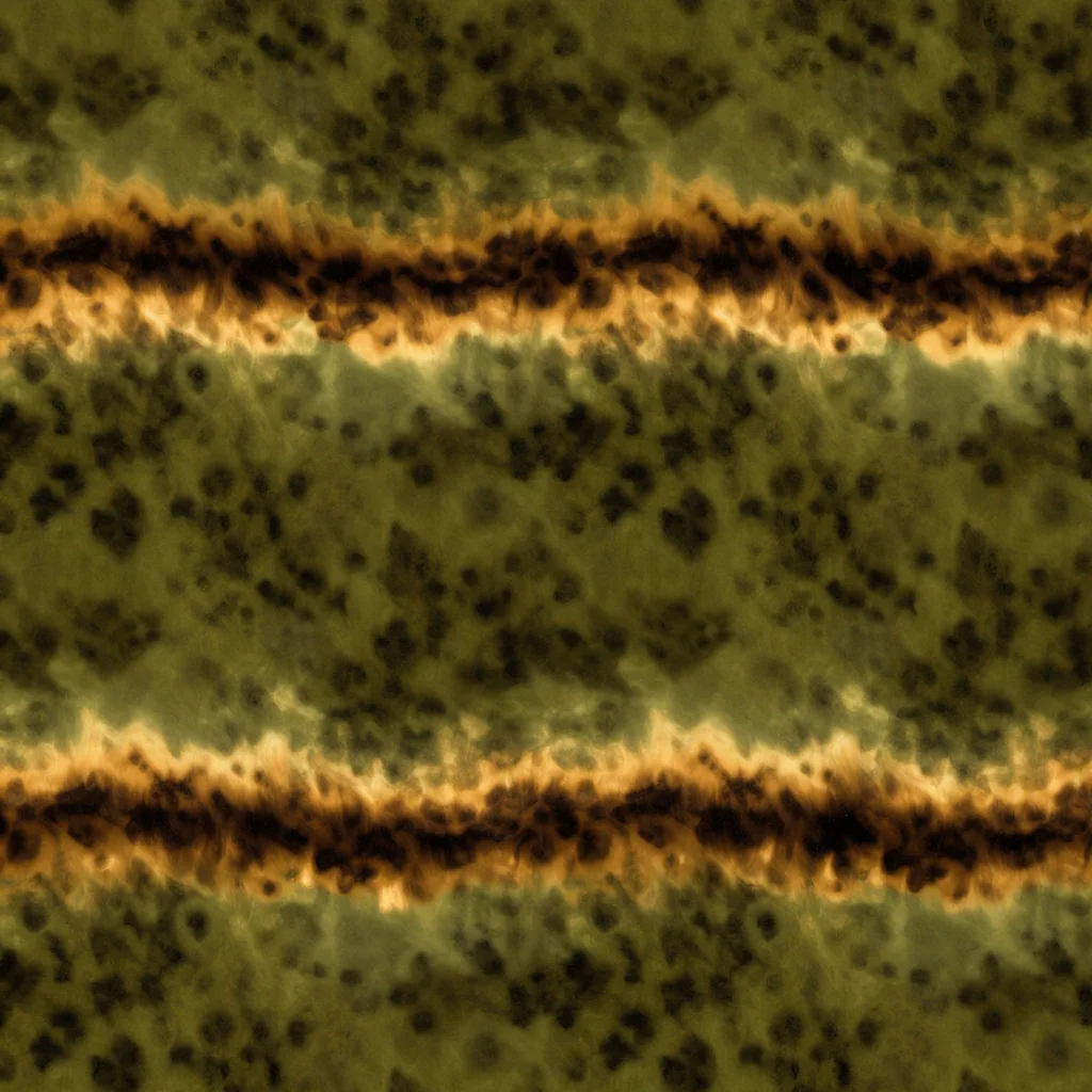
Tortoiseshell pattern: classic, amber, dark in three colourways
Make your ownTortoiseshell
Describe yours. We'll remake the whole pack your way.
More like this
the whole catalog →
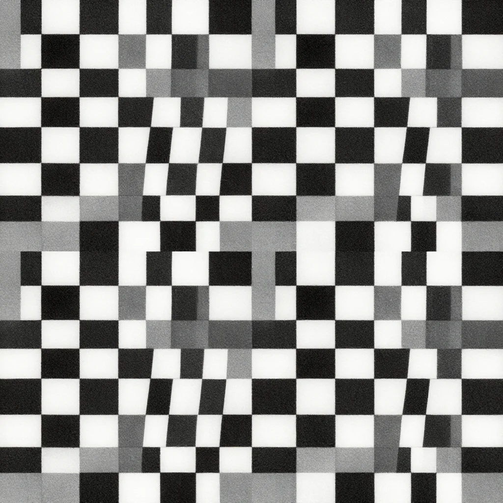

every sample — three subjects, three styles ↓
Tortoiseshell is not a repeat of shapes but of depth: an amber ground with darker mottling that seems to sit under a polished surface. These nine hold a classic mid-tone reading, a lighter amber version and a darker, deeper mottling. Ask for a cooler or warmer ground and the same layered shine carries it.
- a phone wallpaper
- an eyewear or accessory print
- a stationery cover design
- a home decor accent print
- a sticker sheet
Frequently asked questions
- What size do these print at?
- Each mottled field is a seamless surface repeat at A3 proportions, printing clean at A4 or scaling to larger surfaces.
- Can I get a different ground colour?
- Yes — name a cooler or warmer tone, and the same layered mottling renders it.
- What's the difference between the three colourways?
- Classic balances mid-tone mottling on an amber ground; amber lightens the ground for a brighter, honeyed read; dark deepens both the ground and the mottling.
- Why does the pattern need to look like it sits under a polished surface?
- Flat mottling without that layered depth reads as a stain, not tortoiseshell — the grammar keeps a sense of shine and depth over the pattern, the way a spectacle frame or hair comb reads.
About toile
This page is a showcase and a starting point: nine samples already rendered, three readings of the pack crossed with three styles, each shown at the size and ratio it was made for. Take any of them further on the wall with a few words, or ask for all nine again under your own direction; a sign-in keeps what you make, and it is free while Toile is new. The recipe behind each sample — the subject, the style, the palette, the framing — travels with the image rather than staying private to the render: it is in the alt text of every sample and in the page's own structured data, so a search engine reads the same handles a person would.