/graffiti-alphabets · illustration
Graffiti alphabets: throw-up, block and arrow letters, A to Z
Make your ownGraffiti alphabets
Describe yours. We'll remake the whole pack your way.
More like this
the whole catalog →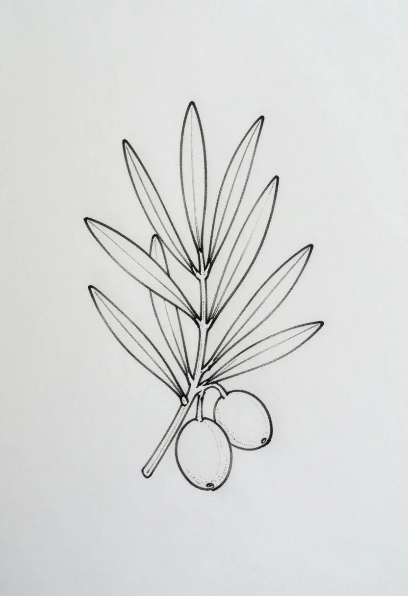
every sample — three subjects, three styles ↓
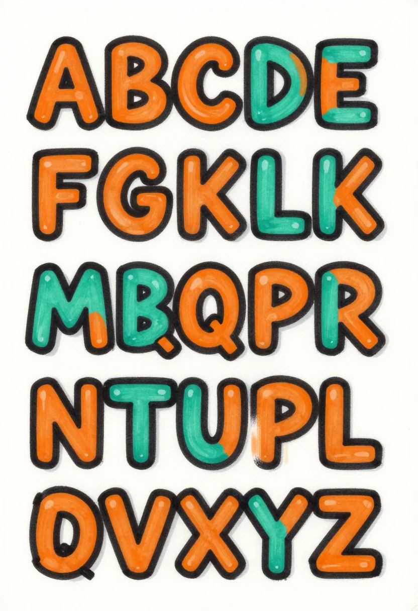
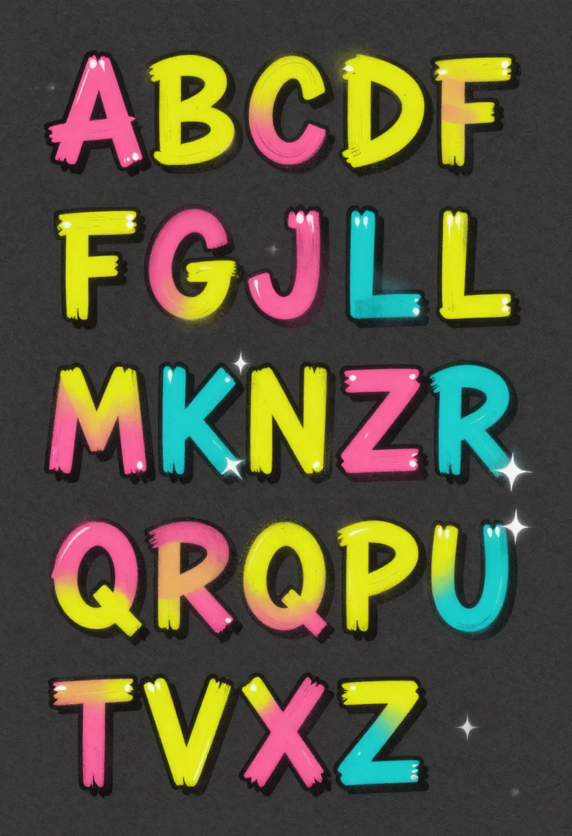
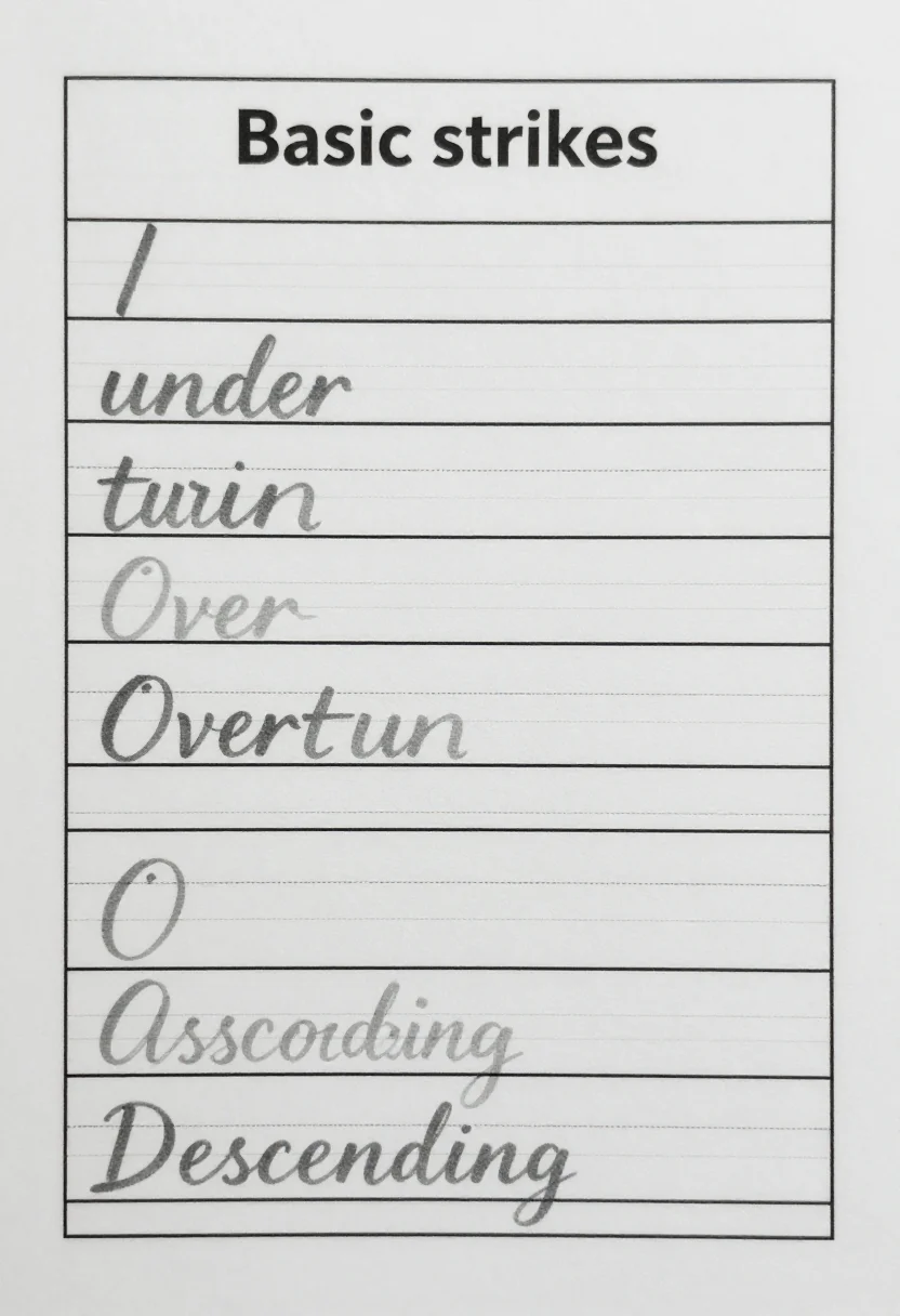
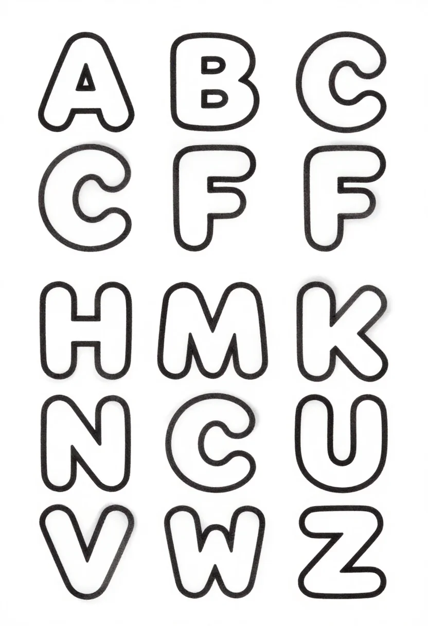
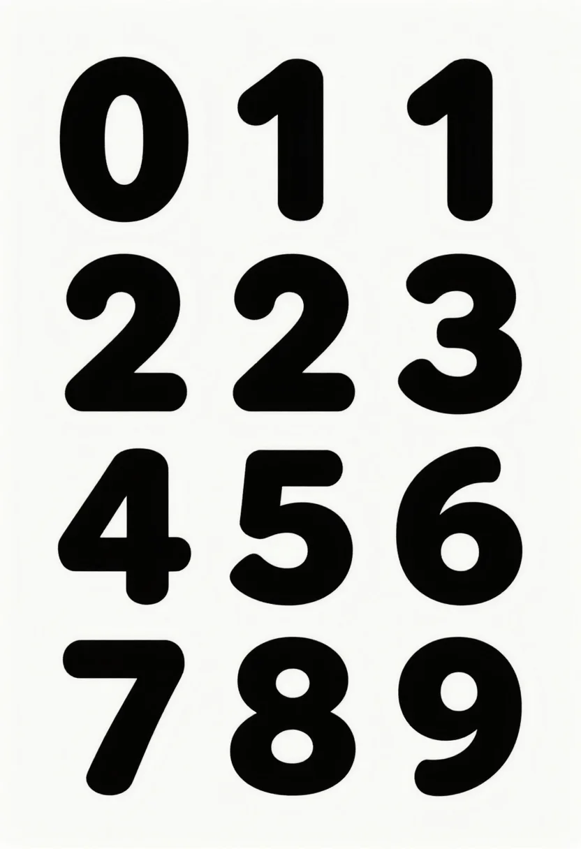
A graffiti alphabet is a set of letters a beginner copies one by one into a sketchbook. These nine sheets give full A to Z charts in rounded throw-up letters, squared block letters and letters ending in sharp arrows. Each is drawn in fat marker, thin fineliner or flat neon fills. Every letter reads on its own. Ask for lowercase, the digits or a color scheme such as green and gold.
- a sketchbook practice page
- a lettering warm-up before a wall piece
- a class project on street lettering
- a reference chart for copying letters
Frequently asked questions
- Does each chart cover all 26 letters?
- Yes. Each of the three styles is a full A to Z chart in five rows.
- How is throw-up different from block?
- Throw-up letters are rounded and quick. Block letters are squared, with straight sides.
- Can I get lowercase or numbers?
- Yes. Ask for lowercase or the digits 0 to 9, and the same chart is drawn in that form.
- Are these drawn in color?
- Marker and neon use flat color fills. Fineliner is thin black line with light pencil construction lines.
About toile
This page is a showcase and a starting point: nine samples already rendered, three readings of the pack crossed with three styles, each shown at the size and ratio it was made for. Take any of them further on the wall with a few words, or ask for all nine again under your own direction; a sign-in keeps what you make, and it is free while Toile is new. The recipe behind each sample — the subject, the style, the palette, the framing — travels with the image rather than staying private to the render: it is in the alt text of every sample and in the page's own structured data, so a search engine reads the same handles a person would.